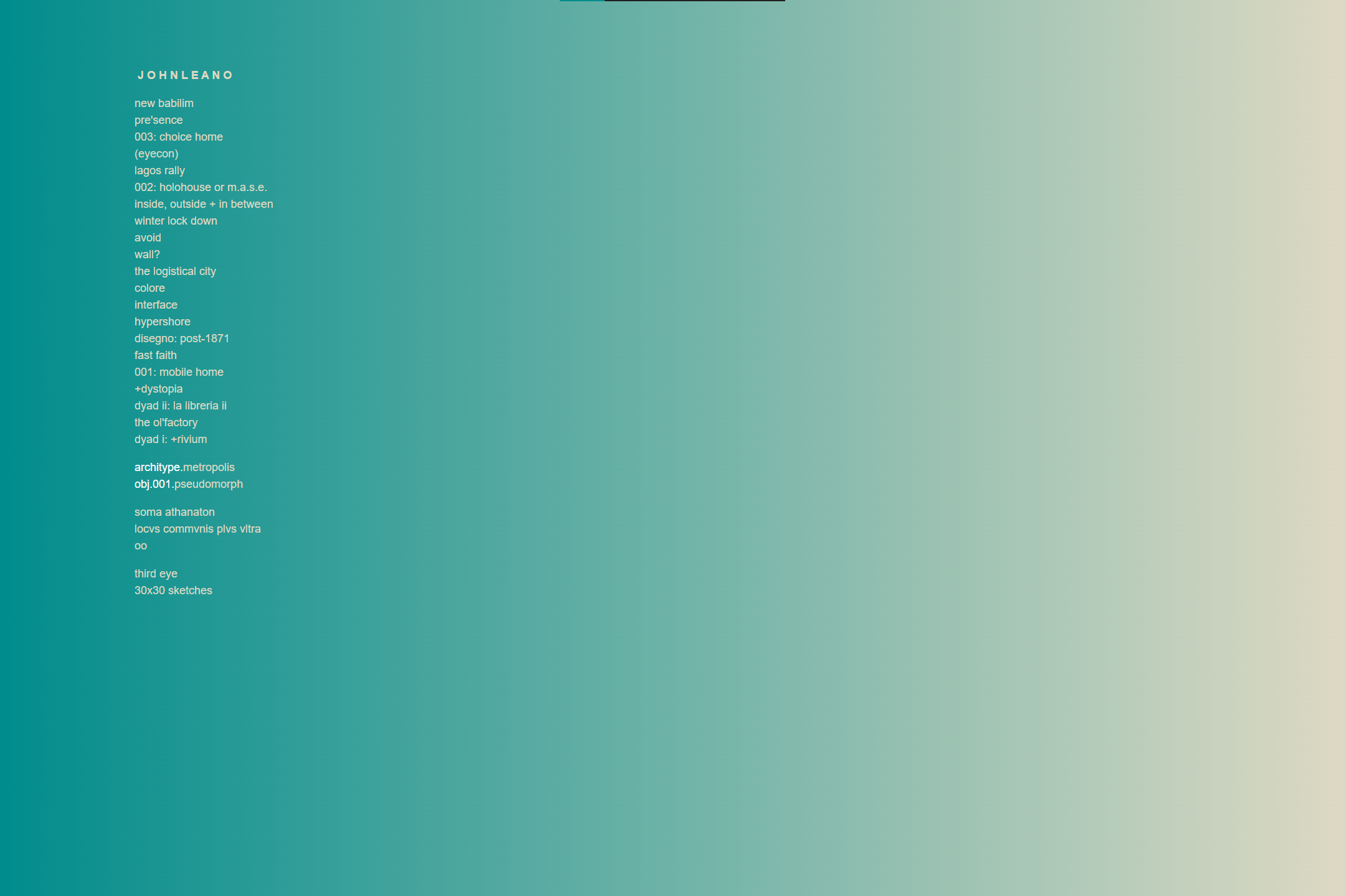
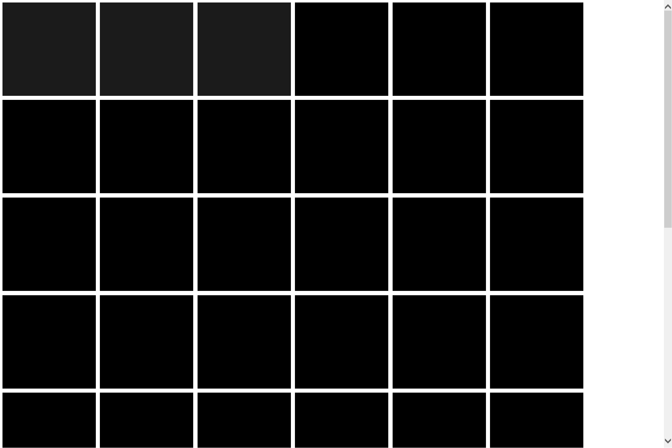
Version 6 shown above reduces the website grid to its most basic form - an array of equal black squares with no text, images or hover effects - and exposes the grid itself as a form of navigation. Websites are first and foremost sites located on the web and can thereby be spatially designed as if they were physical spaces or a virtual extension. The design suggests a proto-language or framework for an alternative architecture of the internet - a webspace or series of virtual "rooms". Perhaps appropriate for the attention span of the modern internet user, it also builds in the elements of mystery, surprise and spontaneity by removing any indication of direction or content. This approach attempts to unlock previously "non-functional" or "impractical" geometric elements or basic shapes as equally valid means of navigating the web. The grid organizes a website like it organizes objects, neighborhoods, cities, etc., and in the same way brings a level of order to user behavior. The homogeneous blocks posit unity, but also a visual rejection of difference. Each unique page is part of a greater whole but gets lost in the collective. You may not know where you're going, but the excitement is in the process of finding out where you arrive, if at all.

